WORK
Hearth & Bean
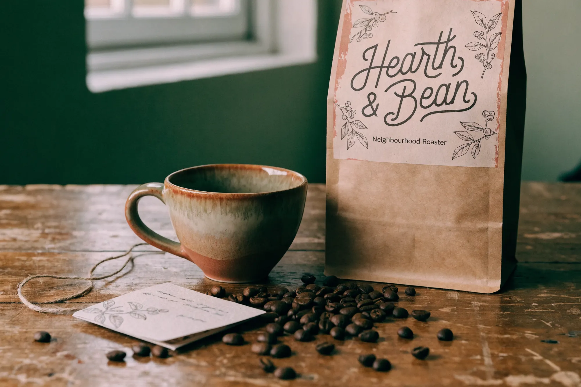
We used no pattern at all. The identity is carried by hand lettering, botanical drawing and the texture of the paper itself, which is what a brand that must not look machine-made needs.
Boutique coffee2025
DisciplineBrand identity, packaging
Concept work. The brand and the numbers are invented.
The brief
A neighbourhood roaster wanted the coffee it sells across its own counter to sit on a shelf as well. On a shelf, something weighed and bagged by hand reads as factory output.
The approach
The name is drawn, not set. The label is pasted onto the bag rather than printed across it, so the lower half stays bare kraft and the material speaks for itself. That costs legibility at shelf distance, where a drawn name resolves slower than a typeset one, and we took the trade because this bag is bought in the hand.
Delivered
- Hand-drawn wordmark
- Botanical drawing set
- Kraft bag label
- Note card and twine tie
- Label typesetting rules
Details
- Lettering
- Drawn by hand
- Pattern
- None, paper texture instead
- One colour on kraft
- Drawing
- Coffee branch, pencil line
Contact
Got something worth building?
Write one sentence: what you do and what you need. We reply within the same working day, Istanbul time. If we are not the right fit we say that too, instead of wasting your time.