WORK
bakerly
The wordmark is lowercase and it never gets loud. They wanted a brand that greets you at the counter, not one that shouts from the window.
Bakery2024
DisciplineBrand identity, packaging
Concept work. The brand and the numbers are invented.
The brief
Most of what this bakery sells leaves the counter as a present for somebody else. The packaging did not know that; it looked like packaging.
The approach
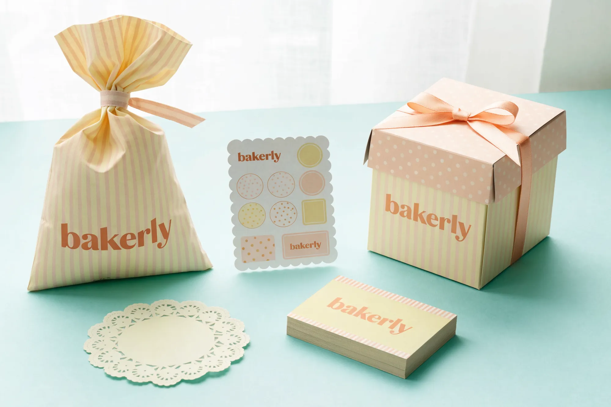
The wordmark stays lowercase and never gets a bigger job than the paper does. The system rests on two patterns rather than one logo, a fine stripe and a small dot, so a box, a bag, a card and a sticker sheet all read as one parcel. Pastels lose the fight for attention through a window, and we let them lose it, because this decision gets made at the counter.
Delivered
- Lowercase wordmark
- Stripe and dot patterns
- Gift box with ribbon
- Striped paper bag
- Scallop-edged sticker sheet
- Business card family
Details
- Wordmark
- Lowercase, rounded cut
- Palette
- Mint, cream, peach
- Pattern
- Fine stripe, small dot
- Paper
- Matte, uncoated, flat colour
Contact
Got something worth building?
Write one sentence: what you do and what you need. We reply within the same working day, Istanbul time. If we are not the right fit we say that too, instead of wasting your time.