WORK
Tuz Yayınevi
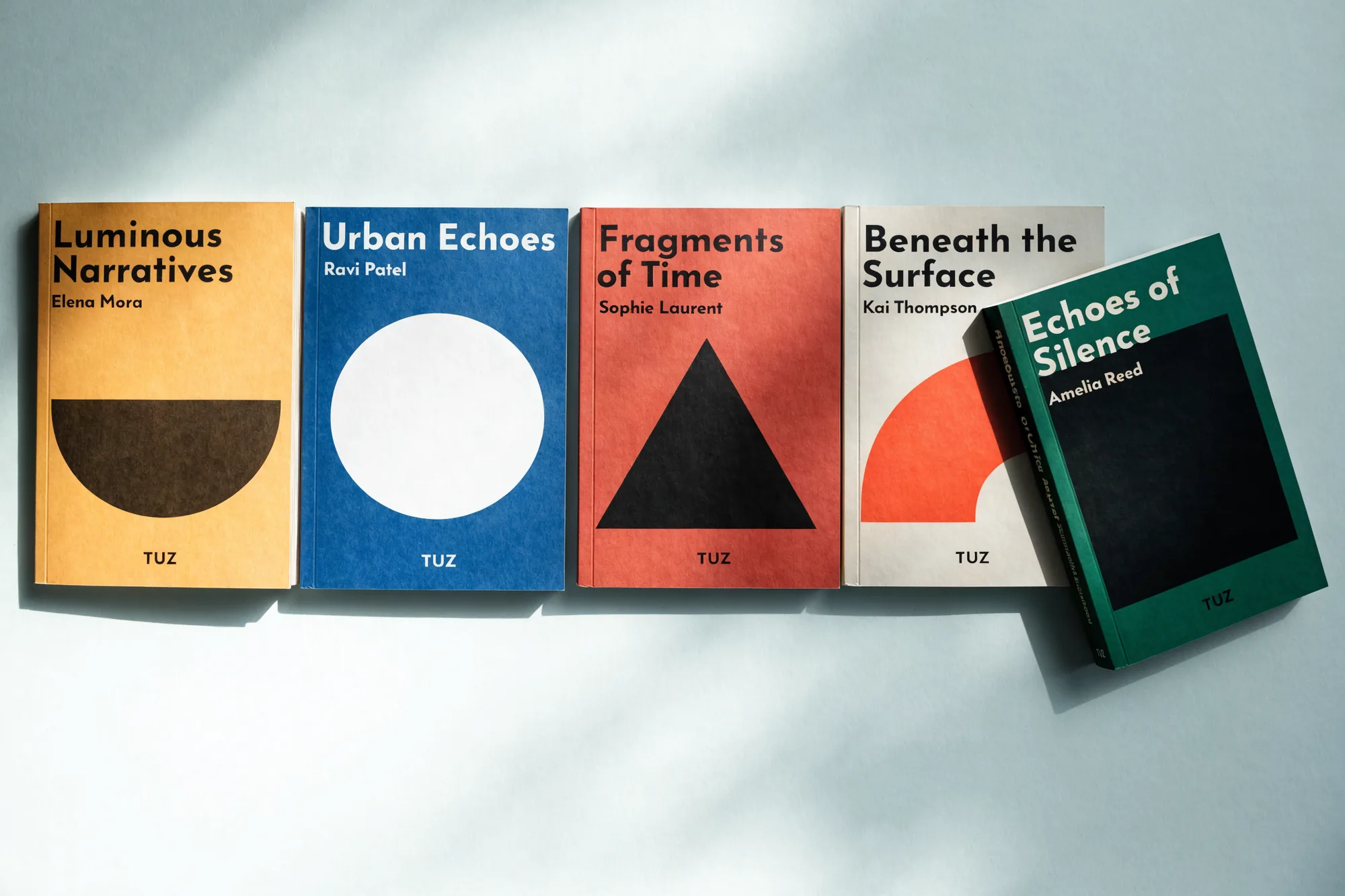
The cover system and the site share one typographic scale, so the shelf and the screen speak the same language.
Publishing2024
DisciplineBrand identity, website
Concept work. The brand and the numbers are invented.
The brief
Covers were commissioned one at a time, so a shelf of their books read as five publishers rather than one house. The website did not help, since it treated a cover as a thumbnail and stopped there.
The approach
A cover stopped being a commission and became a system: one flat ground, one geometric form, the title at top left, the imprint at the foot. Freedom stayed in the colour and the shape and left the typography altogether, which cost the house any look of a series and bought five unlike covers that still read as one publisher. Screen and shelf run on one scale, so a book holds the same proportion in a browser as it does in the hand.
Delivered
- Cover system, five forms
- Imprint mark
- Typographic scale
- Publisher website
- Spine and colophon layout
Details
- Cover
- One ground, one form
- Title
- Top left, fixed size
- Colour
- Per book, not per series
- Imprint
- Foot of every cover
Contact
Got something worth building?
Write one sentence: what you do and what you need. We reply within the same working day, Istanbul time. If we are not the right fit we say that too, instead of wasting your time.